Landing pages persuade users to take an action like signing up for a free trial, downloading a resource, registering for an event, or making a purchase.
Because landing pages focus on driving one particular action, they often perform better than standard webpages and are used in marketing campaigns.
In this guide, you’ll learn what a landing page is, when to create one, and best practices to create landing pages that convert. You’ll see real landing page examples and a Semrush case study showing how landing page optimization impacts results.
Let’s begin.
What Is a Landing Page?
A landing page is a webpage that’s designed to drive one action, like a sign-up, download, or purchase.
Landing pages can be standalone pages built for specific digital marketing campaigns, or pages that live within a website’s structure to support ongoing goals.
Landing pages are commonly linked to from paid ads, email promotions, and other campaigns. Having that page closely match the campaign's message and visuals helps maintain relevance and can improve conversion rates.
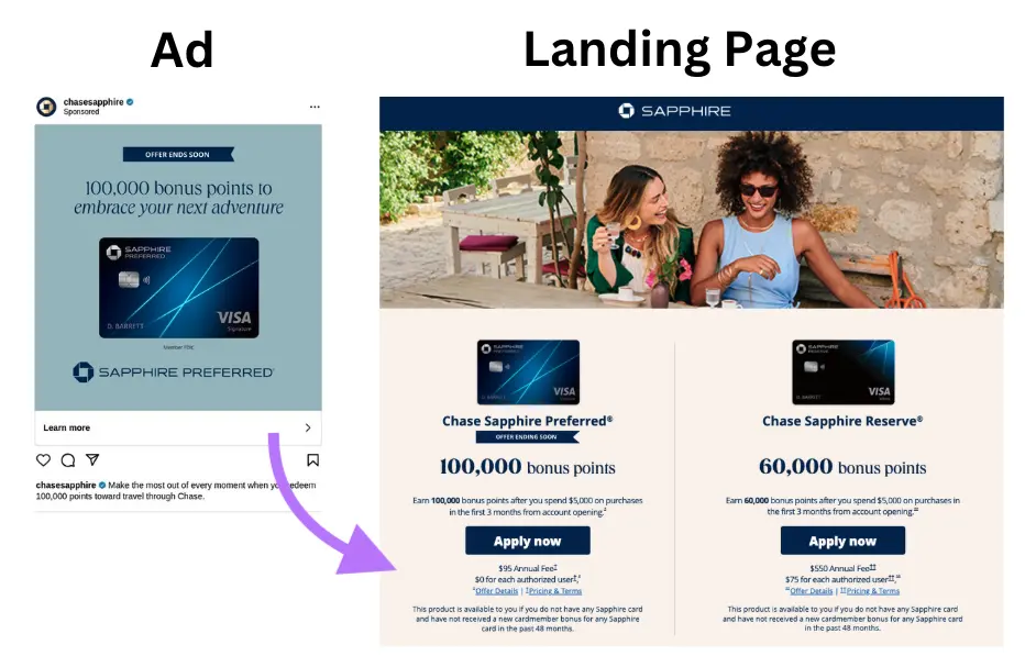
Most effective landing pages share some core elements:
- Benefit-driven headline: A clear, sentence-style headline that communicates the primary value of taking action
- Calls to action (CTAs): Action-oriented phrases that prompt users to take the next step, typically shown on buttons
- Supporting text and visuals: Copy and images that explain the offer and reinforce its value
- Social proof: Testimonials, reviews, use statistics, or brand logos that build trust with visitors
- Submission form: A form that collects key information to convert visitors into leads or users
Landing Page vs. Webpage vs. Website
A landing page is a specific type of webpage (a single document accessed via browser) designed to drive a particular action on a website.
A website is a brand’s main online presence, with many connected webpages, files, and other content housed under a single domain. It typically includes navigation menus and supports multiple conversion actions.
What's the Purpose of a Landing Page?
The purpose of a landing page is to drive a high conversion rate by getting visitors to complete a desired action.
A good landing page improves campaign performance without increasing reach because it’s built for focus rather than exploration. This is because landing pages are:
- Tailored to specific use cases: Messaging and visuals align with the audience and point toward the desired action
- Free from distractions: Limited navigation and fewer links keep the main offer the focus
- Easy to test and analyze: Having a single goal makes it easy to experiment and measure performance
Good landing pages can also improve your paid campaigns. On platforms like Google, Facebook, and Microsoft, ads that link to relevant pages are more likely to earn better placements and a lower cost per click (CPC).
When Should You Use a Landing Page?
You should use a landing page when you want a specific audience to take a specific action.
Below are common scenarios where creating a dedicated landing page is especially effective.
Launching a New Offering
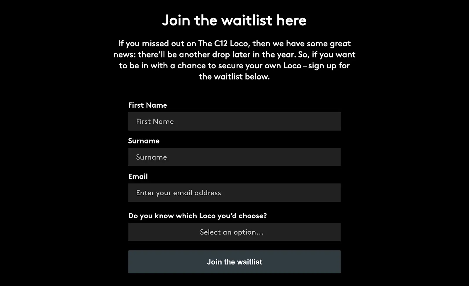
Create a landing page when launching a new product, service, or feature to generate early interest and build pre-orders or leads before it goes live.
For example, Christopher Ward had a "join the waitlist" landing page to collect email addresses ahead of a product drop:
Once your offering launches, you can repurpose your landing page to support sales or redirect it to the live product page.
Running a Promotion
Create a landing page when running a time-bound promotion to keep visitors focused on the offer.
A dedicated promotional landing page provides a consistent experience and reduces distractions, which increases the likelihood of conversion.
For example, LEGO uses a Black Friday landing page tailored to U.S. audiences.
Outside the promotion window, the page builds anticipation for the coming year and encourages visitors to keep shopping:

During the promotion period, the same page highlights active deals and guides users toward purchase.
According to Semrush's Top Pages dashboard, LEGO's Black Friday landing page attracted more than 206K organic search visits, 119 AI traffic, and 149K paid search visits in November 2025.

Creating Lead Magnets
Create a landing page when offering a lead magnet (a high-value piece of content exchanged for a visitor's contact information) to drive more conversions.
Having a dedicated lead magnet landing page also makes it easier to promote the asset across channels like email and social media.
For example, Salesforce uses a landing page to distribute its Connected Financial Services Report and has shared the page URL through LinkedIn:

Targeting New Audiences
Creating a landing page specifically for a new or distinct audience segment lets you tailor messaging, visuals, and offers to a particular group of prospects to improve relevance and conversion rates.
For example, Canva creates landing pages for different audiences, such as sales teams and students:
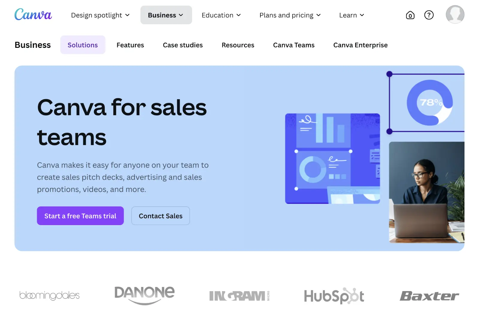
Audience-specific landing pages also support organic search visibility. Because each page targets a specific audience and intent, they can show for relevant keywords and prompts.
What Are the Different Landing Page Types?
Different landing page types let you align with specific campaign objectives and include the following:
Lead Generation Pages
Lead generation pages are designed to collect contact information through a form.
Generally speaking, lead generation pages work best for B2B companies, SaaS products, and service businesses building email lists. The goal is typically to offer a service or valuable piece of content in exchange for user details.
Click-Through Pages
Click-through pages are designed to educate and persuade visitors before sending them to a conversion page to complete an action, so they’re useful when visitors need more context before committing.
While click-through pages don't include forms, they do typically provide product/service benefits, social proof, and a clear CTA button that leads to a checkout page or sign-up flow.
Ecommerce businesses often use click-through pages before checkout, while software companies use them before a free trial registration.
Squeeze Pages
Squeeze pages are minimalist landing pages designed to capture email addresses with minimal friction.
These pages usually feature a single form field and very little copy—just enough to communicate the value of the offer. Squeeze pages are commonly used for newsletter sign-ups, webinar registrations, and early-access lists.
Sales Pages
Sales pages are long-form landing pages designed to convert visitors into higher-commitment actions, such as expensive purchases, long-term subscriptions, or contracts.
Good sales pages include detailed product/service explanations, testimonials, pricing information, and FAQ sections to address objections and build confidence.
B2B companies selling enterprise software and creators selling online courses often use sales pages when buyers need more information and reassurance before committing, such as for higher price points or longer decision cycles.
7 Landing Page Best Practices [with Examples]
Follow these landing page best practices to get more value from your campaigns:
1. Optimize Above the Fold
Optimizing above the fold means designing the top portion of your landing page to immediately communicate value and prompt action without requiring users to scroll.
Most effective landing pages include these above-the-fold elements:
- An engaging headline that conveys the offering and piques interest
- A subheading that describes the benefit of the offering
- A supporting visual
- A CTA button encouraging visitors to take the next step

Create a Clear and Compelling Headline
Write a headline that clearly communicates the offer and gives visitors a reason to learn more, increasing the chances of conversion.
Strengthen headlines by using proven psychological triggers, such as:
- Urgency: "Save 50% on Annual Plans Before April 1"
- Curiosity: "See What’s Slowing Down Your Website’s Performance"
- Specificity: "Find and Fix Technical SEO Issues in Minutes"
- Pain points: "Stop Losing Customers to Slow Page Load Times"
For best results, align your headline closely with the ad copy or email that brought visitors to your landing page. Matching the message reassures users they’re in the right place and reduces bounce rates.
For deeper guidance, see our landing page copywriting tips.
Use a Benefit-Driven Subheading
A subheading supports the headline by clarifying the primary benefit of the offer and adding context without overwhelming the visitor.
Effective subheadings explain how the offer delivers value or what the visitor will get after converting, helping users quickly decide whether the page is relevant to them.
Include a Supporting Visual
A supporting visual in the hero section reinforces the headline and subheading and helps visitors understand the offer at a glance.
Effective hero visuals may include product screenshots, short videos, or illustrations that show the outcome or value of the offer rather than just its features. The goal is to quickly confirm relevance and support the primary CTA—not to decorate the page.
When choosing a hero visual, prioritize clarity and alignment with the conversion goal:
- Show the product or service in context, when possible
- Match the visual style to the target audience
- Emphasize outcomes or results
The strongest hero visuals sit close to the headline above the fold, where they can immediately reinforce the core message and guide attention toward the CTA.
While this section focuses on the main visual in the hero area, the same principles—clarity, performance, accessibility, and relevance—should be applied consistently to all visuals throughout the landing page.
Design Strong Calls to Action
Your CTA is where conversions happen, so its copy, design, and placement need to make the next step obvious and easy.
- Use action-oriented button copy: Replace generic labels like “Submit” or “Click Here” with benefit-focused language. First-person phrasing (for example, “Start My Free Trial”) often performs better because it creates a sense of ownership.
- Make the CTA visually distinct: Use a button color that contrasts clearly with the page background, give it enough size and whitespace for easy interaction, and apply subtle visual cues to draw attention.
- Place CTAs where intent is highest: Include the primary CTA above the fold and repeat it near natural stopping points on longer pages so users can convert as soon as they’re ready.
2. Leverage Social Proof
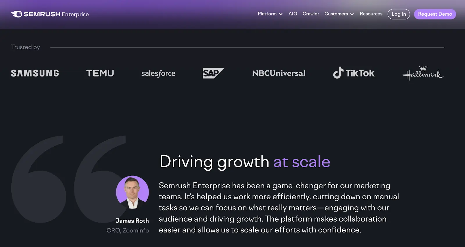
Leveraging social proof means showing visitors that others trust and use your product or service, which builds confidence and reduces hesitation.
You can add social proof to a landing page by including:
- Customer or client logos
- Testimonials or short quotes
- Use or adoption metrics
- Review or ratings widgets from trusted platforms
For example, Semrush uses a trust bar with recognizable client logos and a testimonial tailored to the target audience:
3. Minimize Navigational Elements
Minimizing navigational elements keeps visitors focused on the primary action instead of clicking away from your landing page.
Many brands use landing pages that don’t have full-site navigation and limit links to only what’s essential.
For example, The New York Times subscription landing page excludes the main navigation menu and footer, leaving users with a clear offer and call to action.
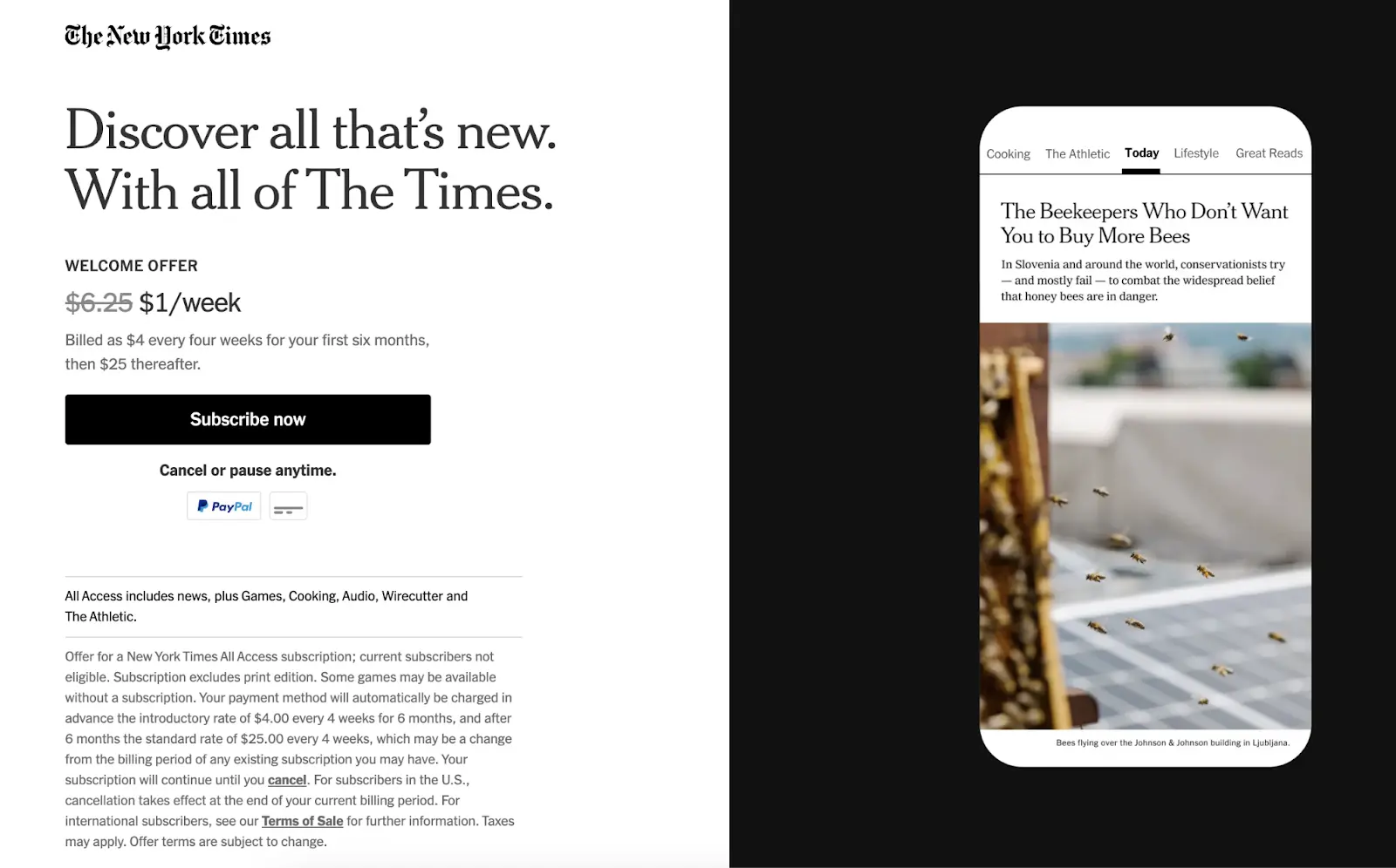
Note that minimizing navigation doesn’t mean removing it entirely. Landing pages should still provide access to necessary links—like privacy policies, terms, and limited brand navigation—to avoid frustrating users or blocking alternative conversions.
Navigation quality also affects paid search performance. Google has stated that poor landing page navigation can reduce ad visibility or increase costs because it creates a weak user experience.
4. Run A/B Tests
A/B testing compares two versions of a landing page by showing each version to a portion of visitors and measuring which one performs better to inform your landing page optimization.
In a typical test, users are split equally between a control (original version) and a variant (modified version). The winning version can then become the main page.
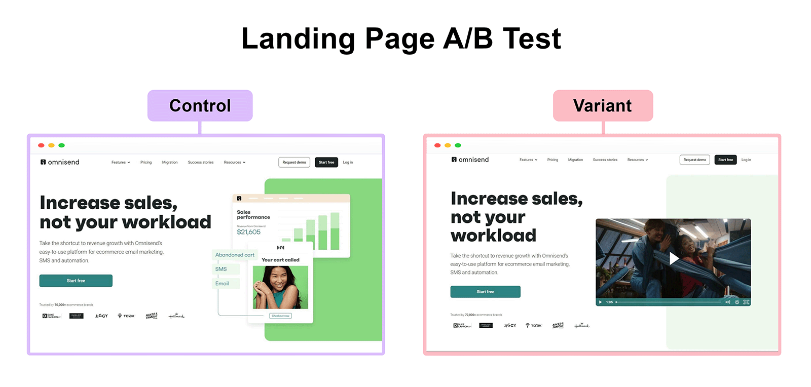
You can A/B test elements such as headlines, body copy, visuals, layouts, CTAs, and form design. Just stick with testing one element at a time—this approach replaces guesswork about what actually impacted performance.
Even when you’re not actively A/B testing, monitor key landing page performance metrics. Ongoing monitoring lets you see if landing pages perform as expected. And helps you identify issues early.
5. Apply SEO Best Practices
Using SEO best practices on landing pages makes it possible for them to appear in search engine results and AI system answers.
Plus, tactics that are good for SEO tend to be good for conversions.
Key SEO considerations for landing pages include:
- Crawling and indexing: Make sure landing pages aren’t accidentally blocked by robots.txt, “noindex” tags, or crawl rules if you want them to appear in search results. An exception may be highly time-sensitive campaign pages that won’t be reused or redirected after the promotion ends.
- Duplicate content: Landing pages that closely resemble other pages can harm search visibility if search engines can’t determine which version to rank. Use canonical tags to indicate the preferred version and avoid competing URLs.
- Page speed: Faster load times improve rankings, usability, and engagement
- Internal links: Use internal links intentionally to support discoverability, but avoid adding unnecessary links that distract visitors from the primary conversion goal
- Mobile SEO: Landing pages should perform reliably on both desktop and mobile devices
- Accessibility and security: Pages should be accessible to all users and served securely, including proper contrast, readable text, and HTTPS
- Thin content: Even conversion-focused pages need enough meaningful content to satisfy users and search systems. Each section should clearly explain the value of the offer, provide context or proof, and support the primary conversion goal—without padding or irrelevant detail.
- Content clarity for extraction: Structure content so each section can stand on its own, with clear headings, short paragraphs, and a single focus. Lead with the primary benefit, layer in supporting details as users scroll, and use progressive disclosure to introduce complexity without overwhelming readers or search systems.
Use Site Audit to Review Landing Page SEO
Semrush’s free SEO checker, Site Audit, can help identify many of these issues across your landing pages.
A practical workflow looks like this:
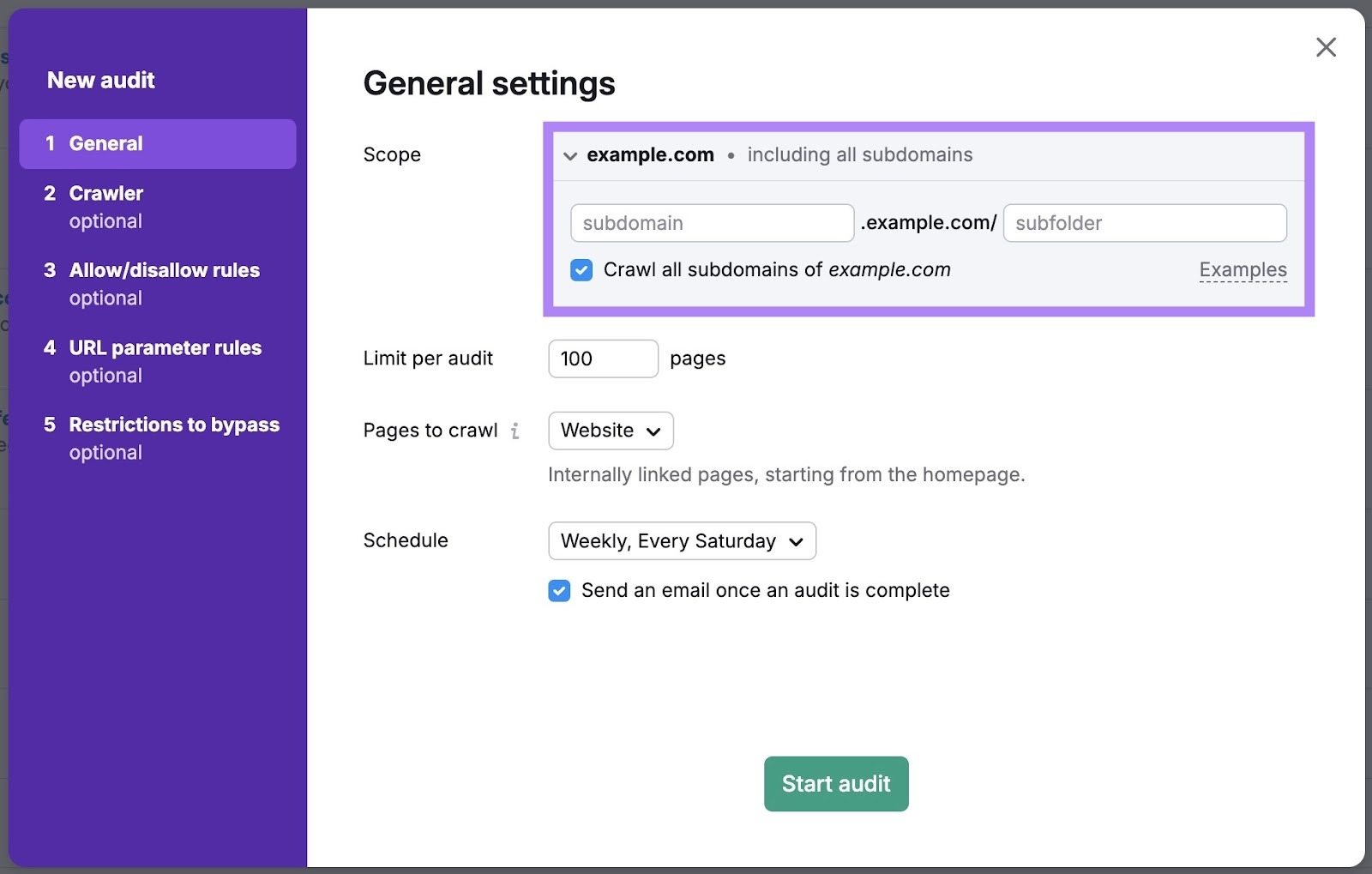
- Ensure landing pages are included in the crawl: Configure crawl settings to include specific folders, URLs, or subdomains where landing pages live so they’re evaluated alongside the rest of your site
- Review issues that affect visibility and performance: Use Site Audit reports to identify problems such as blocked pages, duplicate content, slow load times, or mobile usability issues that may impact both rankings and conversions
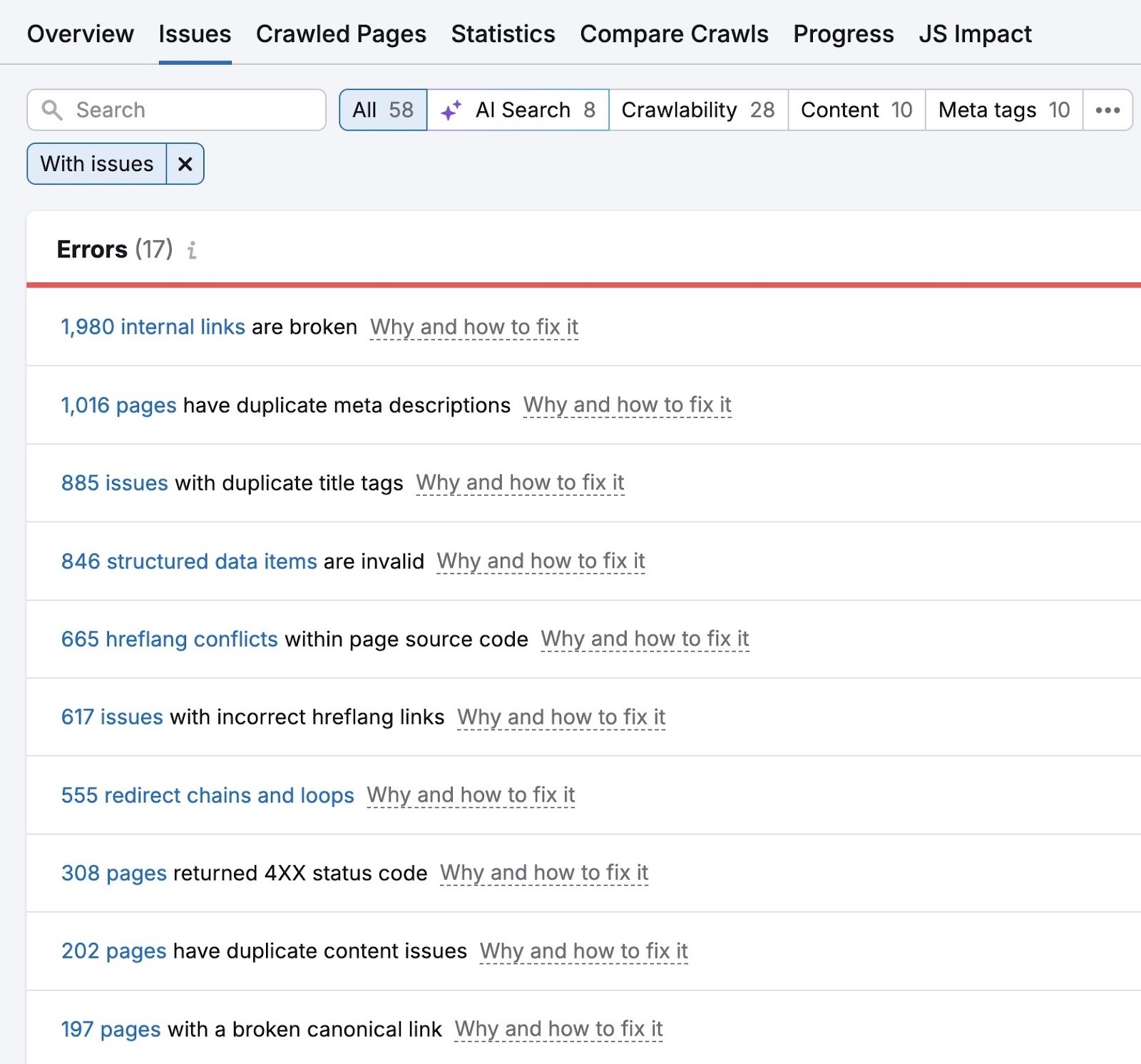
This approach helps ensure landing pages meet SEO requirements without sacrificing their primary conversion focus.
For more detailed guidance, see our SEO for landing pages guide.
6. Optimize Form Design for Maximum Completion
If your landing page includes a form, optimizing it to be as unintrusive as possible makes it easier for visitors to convert.
Minimize overwhelming users by:
- Asking for essential information only: If a phone number or company size isn’t required immediately, don’t request those details
- Using progressive profiling: Collect basic details first, then gather more information during onboarding or follow-up
- Consider multi-step forms: Breaking long forms into two or three steps can improve completion by reducing perceived effort
You can also make forms feel easier to complete by using:
- Clear error messages: "Please enter a valid email address" is more helpful than "Error in field 2"
- Privacy reassurances: Add microcopy near sensitive fields, like "We'll never share your email with third parties"
7. Ensure Mobile-Friendly Design
Mobile-friendly design is essential because many landing page visitors are using mobile devices.
To optimize landing pages for mobile users:
- Use responsive design: Ensure the page automatically adjusts to different screen sizes so content, images, and CTAs remain readable and usable
- Make elements touch-friendly: Buttons and links should be large enough to tap comfortably, with adequate spacing to prevent misclicks
- Prioritize readable text: Use font sizes and spacing that keep content legible on small screens without requiring pinch-zooming
- Simplify layout and navigation: Mobile landing pages should remove unnecessary elements and stack content vertically to maintain focus
- Optimize forms for mobile input: Use appropriate field types, such as email keyboards for email fields and numeric keypads for phone numbers
- Optimize page speed: Mobile users often have slower connections, so minimize large assets and unnecessary scripts to keep load times fast
Test landing pages on real mobile devices to confirm that layouts, forms, and CTAs behave as expected.
Use tools like Google's Mobile-Friendly Test to identify mobile usability issues.
Case Study: Semrush Landing Page
This case study examines a Semrush landing page designed to promote the Site Audit feature and encourage free trial sign-ups.
Rather than focusing on a specific campaign, this example highlights how Semrush applies landing page best practices—such as clear value messaging, focused layout, and trust signals—to guide visitors toward a single action.
The Hero
The hero is the above-the-fold section of the landing page, and is designed to immediately communicate value and guide visitors toward a single action.
On the current Semrush Site Audit landing page, the hero includes:
- Minimalist header: A simplified header with the Semrush logo, keeping distractions to a minimum
- Benefit-driven headline: A clear headline that communicates the primary value of the tool
- Supporting subheadline: Additional context that clarifies what the user gets without adding friction
- Interactive product preview: A visual element that lets visitors explore the tool’s functionality
- Primary CTA button: A clear call to action that directs users to start a free 7-day trial
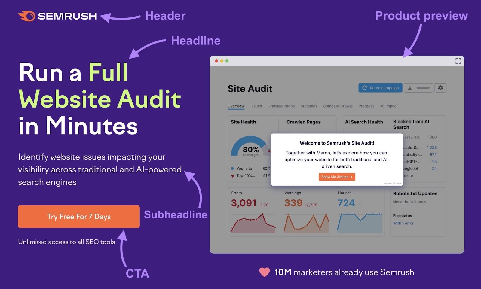
Mariana Clavel, the Content Strategist at Semrush who worked on this landing page, says
“The linked logo is there for brand recognition and to give users a familiar way to explore more of the site if they want to.”
“The headline is bold and benefit-driven, so visitors instantly know what they’ll get. We kept the subheadline simple to support the main message without overwhelming the reader.
“Finally, the product demo adds credibility and makes the page more engaging.”
The Social Proof
Below the hero section, the landing page features a “Trusted by” section displaying logos of well-known Semrush customers.
These recognizable brands help establish credibility early, especially for visitors unfamiliar with the product.

“When someone lands on the page from an ad, they might be unfamiliar with the Semrush brand,” Mariana says. “Displaying recognizable company logos helps us build trust and show that other reputable businesses are using the product.”
Near the bottom of the page, Mariana’s team leverages social proof again by displaying Semrush awards and accolades.
“This extra dose of social proof is useful for hesitant users who need one last bit of validation before clicking the CTA. Think of it as a confidence boost right before the finish line.”

The Solution
The middle section of the landing page expands on the core value proposition by explaining how the Site Audit tool helps users identify and fix website issues.
This section uses short, scannable copy paired with supporting visuals to make the information easy to absorb. Headlines break the solution into clear steps, while visuals reinforce how the tool works and what outcomes users can expect.
Here are some side-by-side mobile screenshots:
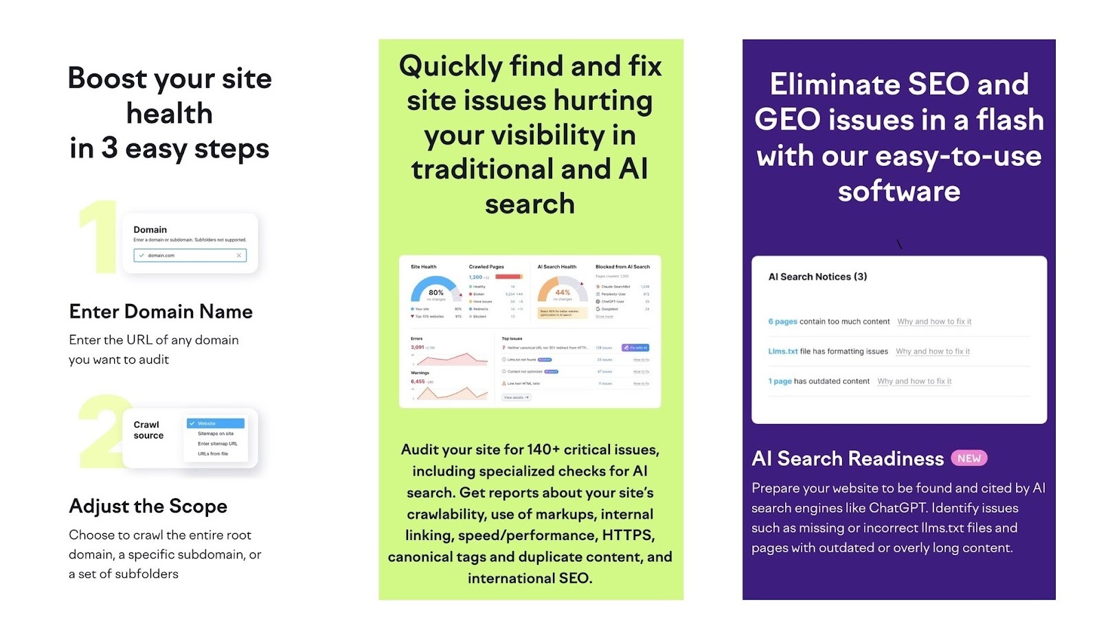
“This part of the page explores the benefits in more detail, so practically minded users can make an informed decision before taking action,” Mariana says.
“We placed eye-catching CTA buttons at key points throughout this section to prompt conversions, using different CTA copy in an effort to maximize engagement.”
A/B Testing Insights
The team uses A/B testing to evaluate how small changes to elements on key landing pages affect results that can be scaled across other pages.
Here are a few things Mariana’s team learned from running A/B tests on the Site Audit-focused landing page:
- CTA: “Try Free For 7 Days” drove more trial sign-ups than other variants
- Visual above the fold: The interactive product demo drove more trial sign-ups and payments compared to static visuals and GIFs
- Social proof: Incorporating trust-focused messaging below the CTA and product demo drove more sign-ups
“We’re also currently testing a video above the fold to further optimize first-screen engagement,” Mariana says.
Create Landing Pages that Convert
Anyone can create landing pages that convert with Semrush’s Landing Page Builder, which allows you to:
- Build fast, mobile-friendly pages with a drag-and-drop editor
- Publish landing pages directly to your domain
- Monitor conversions and other metrics through an analytics dashboard
- Integrate with marketing tools like HubSpot and FreshMail
- Set up and monitor A/B tests
All without any need for coding.

This post was updated in 2026. Excerpts from the original article by Rachel Handley may remain.